There are 3 graphs that we find absolutely vital for turning rows and rows of energy data into actionable energy intelligence. They are:
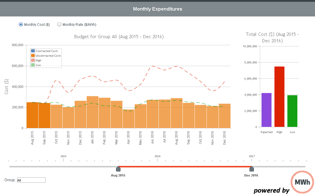
1. A budget forecast. Whenever you’re involved in a commodity business, you have to make sure your data are live and responsive to markets shifts. Energy managers and finance professionals find immediate insights when they interact with budget forecasts that have been informed by real market data inputs.
You’re flying blind without a market-based forecast
Quick explanation of this budget forecast graph: The Budget graph shows actual realized costs for past months as well as a forecast of costs over the next 3 years. The dotted lines on the main bar graph depict the historical high and low costs for the forecasted period. The bar graph to the right shows the total expected, high and low costs for the entire period. This information has been informed by an expert view on the variability of something nobody controls: market prices!
2. Trend review. It may be true that looking in the rear view mirror seems like a very static view of energy costs (especially when we’ve just advocated getting a forward view). But a trend review places your current options in a solid context based on historical prices.
You have to know where you’ve been to have context for where you’re going
Quick explanation of this trend graph: The Cost Trend graph shows how total contract costs have moved over time based on changes in power markets, major usage changes (i.e. a significant change in capacity obligation, for example) or changes in other market prices. This information gives you a context for a decision at a given point-in-time. How do today’s prices compare to historical rates? What’s the impact of those changes?
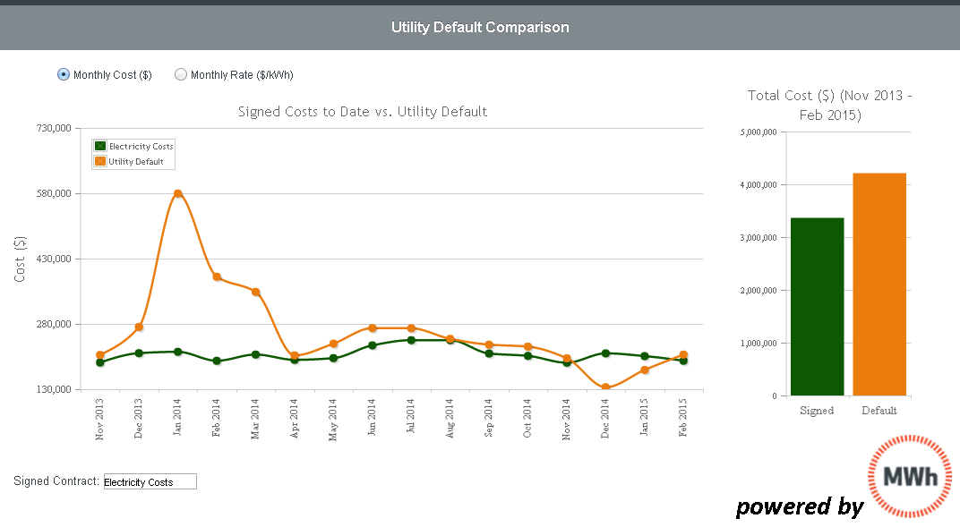
3. Performance tracking. Compare your contract performance to a relevant benchmark. Again, for context and for metrics. Reviewing performance allows for strategy review and adjustment going forward.
Improve business outcomes with continuous bench marking
Quick explanation of this benchmarking graph: Here’s a picture of how your contracts are performing vs. the utility default rate. The so-called default rate is the name for what you would have paid the utility if you had not opted to use a third party supplier. In some markets, this is known as the “price-to-compare”. Note that this isn’t the only useful benchmark that a well-armed energy manager can use to gauge performance.
Bottom line for businesses: With the right information, you can control your energy costs, lower your costs and improve business and purchasing outcomes.


