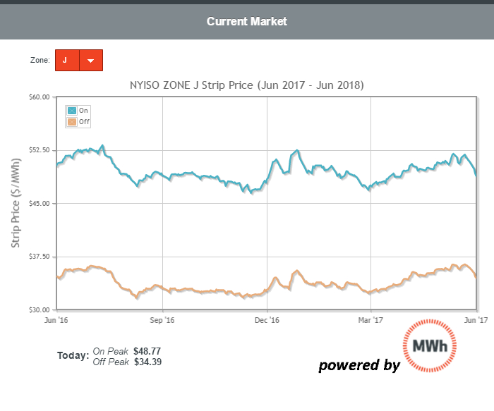
Take a look at the graph (above) of forward power prices for the same period (June ’17 through June ’18) in New York City. The blue line shows how on peak prices have moved over the last year while the orange line shows how off peak prices have moved. Markets are back in the historic low range. As Bloomberg has reported, global commodities have seen a significant price decline. Natural gas is no exception.
If you are interested in managing power or gas cost risk, now is a good time to look at prices for the next 12 months or, better yet, for the following 12 to 24 months.
Bottom line for financial and facilities decision makers. Keep in mind, low forward prices also indicate that there is likely to be low index pricing as well (barring any local disruptions to gas or power resources). Be aware of all your options before just selecting the same product you have chosen in years past.
[maxbutton id=”2″]Call us if you would like a free quick consultation on your energy information, analytics or purchasing strategy.