What is a day in the life of a MWh software customer like? How would I get the most from working with MWh? From time-to-time, energy customers ask us these questions. We thought it made sense for us to publish our frequent response to these kinds of questions.
Note that MWh is part of a larger trend that we’re seeing in the utility industry that involves bringing utilities into the data age. Customers only stand to benefit. Just for example, look at this opinion piece from Utility Dive titled “Access to data: Bringing the electricity grid into the Information Age”.
First things first: Forward market view in MWh software
During a day or a week, most of our customers want to make sure they have an understanding of where energy markets are on a given day. Even if, like most of our customers, they aren’t currently making energy purchases, MWh clients like to review MWh software so they know how markets are performing. You don’t have to be a day trader to want to know what the stock market is doing.
Our customers spend at least some time looking at how the forward market for power is performing.

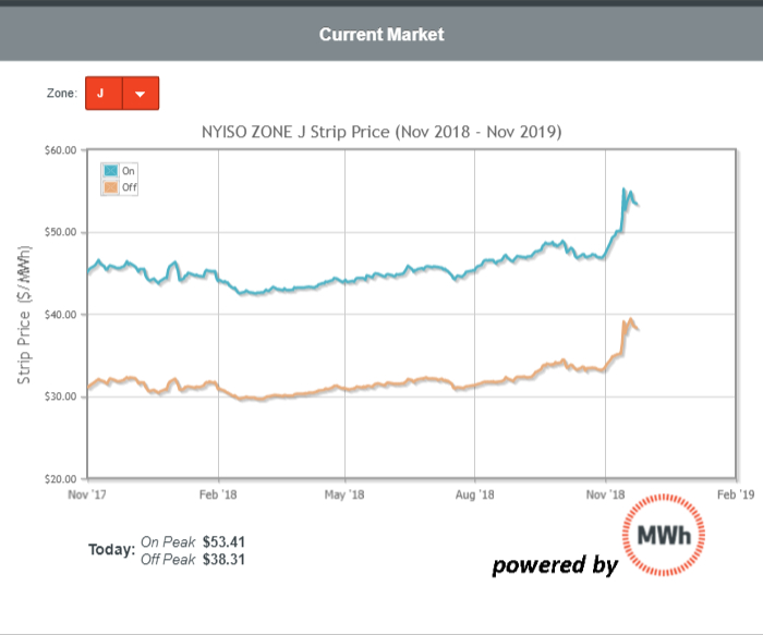
This graph shows wholesale market price trends. Each line represents the average market price over time for the same future time period – the next 12 months.
When you buy has the biggest impact on total cost. Current power markets will determine 50% of your total cost. If today’s market is at or near historic lows, now is a good time to buy. This is only the energy component of electricity costs;account-specific retail contract prices are displayed on other parts of the software. Nevertheless, this information provides a good quick view of how markets are performing.
Including logging into our software, this step requires about 2.5 minutes.
To answer their questions about market movements, customers will log on to the Megawatt Hour software to view a forecast of the next 12 months of energy forward curves. Sometimes customers want to know how their future budget or costs look based on recent market activity and how current forward market prices compare to forward markets that we’ve seen over the past several months.
In that case, they will review the following graph, which allows them to choose any time period now or 3 years into the future and see what they can expect to pay based on current market prices.

This step requires between 1 and 3 minutes—this step takes longer if you’re interested in looking at different future periods—1, 2 or 3 years from next month, for example.
How do actual costs compare to our budget?
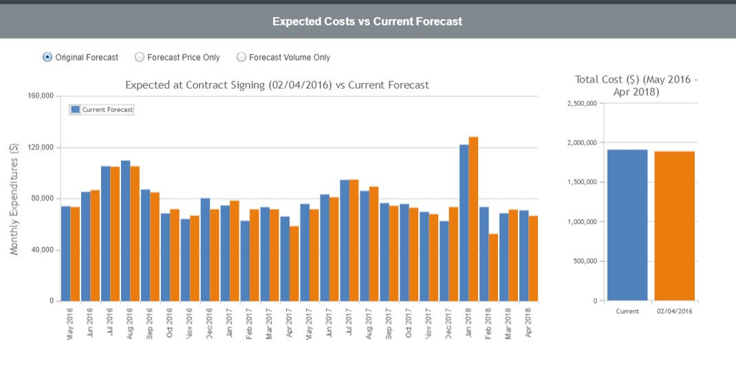
Our customers look at the following graph to determine how last month’s or last quarter’s actual costs compare to forecasts. The blue bars (which uses demonstration data) shows actual costs compared to a prior forecast (in orange). By selecting a radio button, this customer can determine if the difference in realized costs is due to a change in usage or price.

This step requires about a minute to complete. Customers can also choose to download an Excel file summary of the monthly differences between budget and actuals.
Customers find many other ways to identify and track cost reductions using MWh software. Review this article to learn more about other ways to effectively manage energy costs using software.
How are we doing compared to our preferred benchmark?
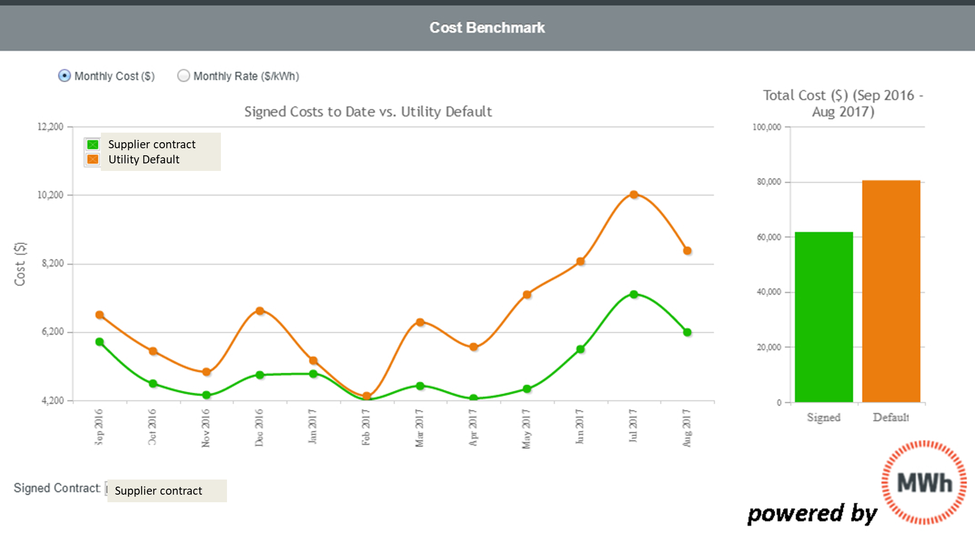
Many customers want to know how their contract is performing compared to a benchmark. One common benchmark compares actual costs to what customers would have paid the utility during the same period. Some customers spend weeks a year preparing to answer this question. Or they try to rely on their supplier for the answer to that question. MWh customers go to a specific report available to them on the MWh’s budget page. The orange line depicts the utility cost for the month. As you can see, the orange line, is higher than the green line, which depicts the demonstration client’s contract cost. The customer has avoided some costs that utility customers paid during the same period.

This step requires about a minute to complete and has new information each month.
Bottom line for energy and finance professionals. This article gives you a sense for how our clients use the information in MWh software. One of our goals is to help our clients’ lives easier. A few minutes with MWh software during a day, a week or a month answers some of the most inscrutable questions that face energy and finance professionals today.
