US Energy Consumption 2019: Overview
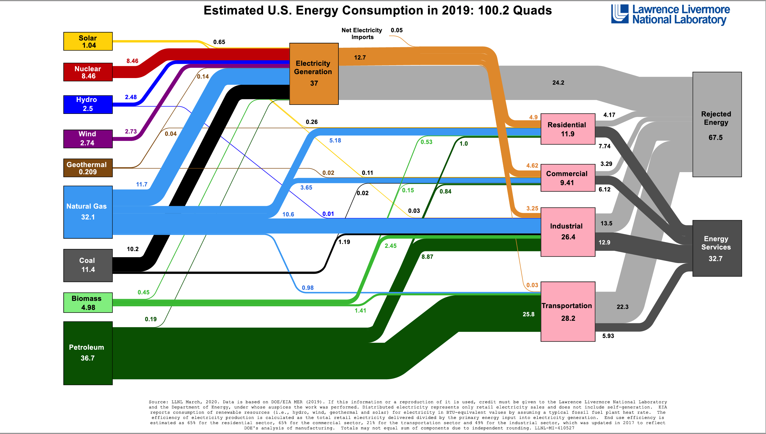
Every year, Lawrence Livermore National Laboratory (LLNL) and the Department of Energy (DOE) produce energy flow charts that graphically show how the US (and individual states) consume energy resources. The following charts show US energy consumption in 2019.
A single energy flow chart depicting resources and their use represents vast quantities of data. Energy resources included solar, nuclear, hydroelectric, wind, geothermal, natural gas, coal, biomass, and petroleum. Energy flow diagrams change over time as new technologies are developed and as priorities change.
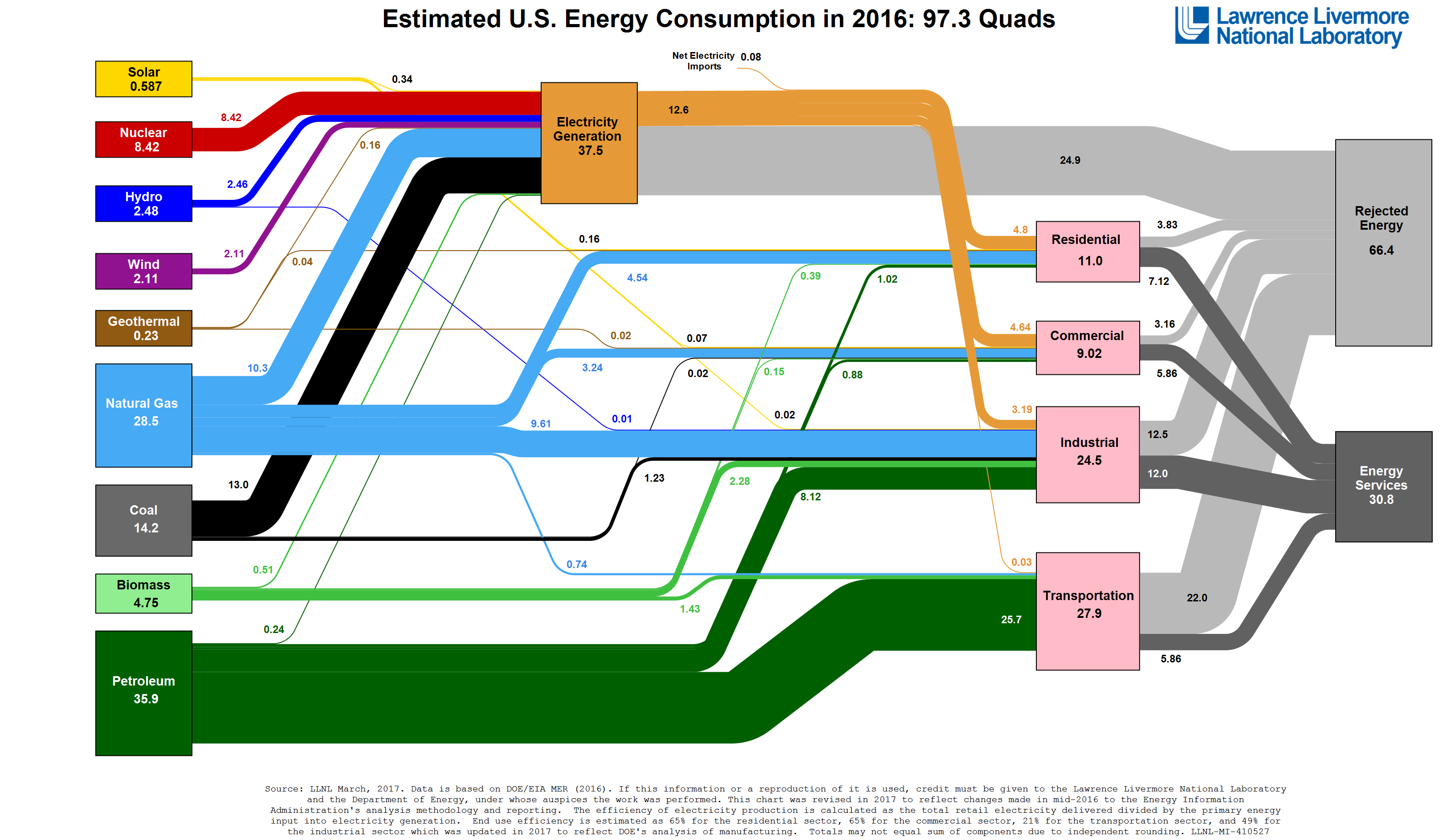
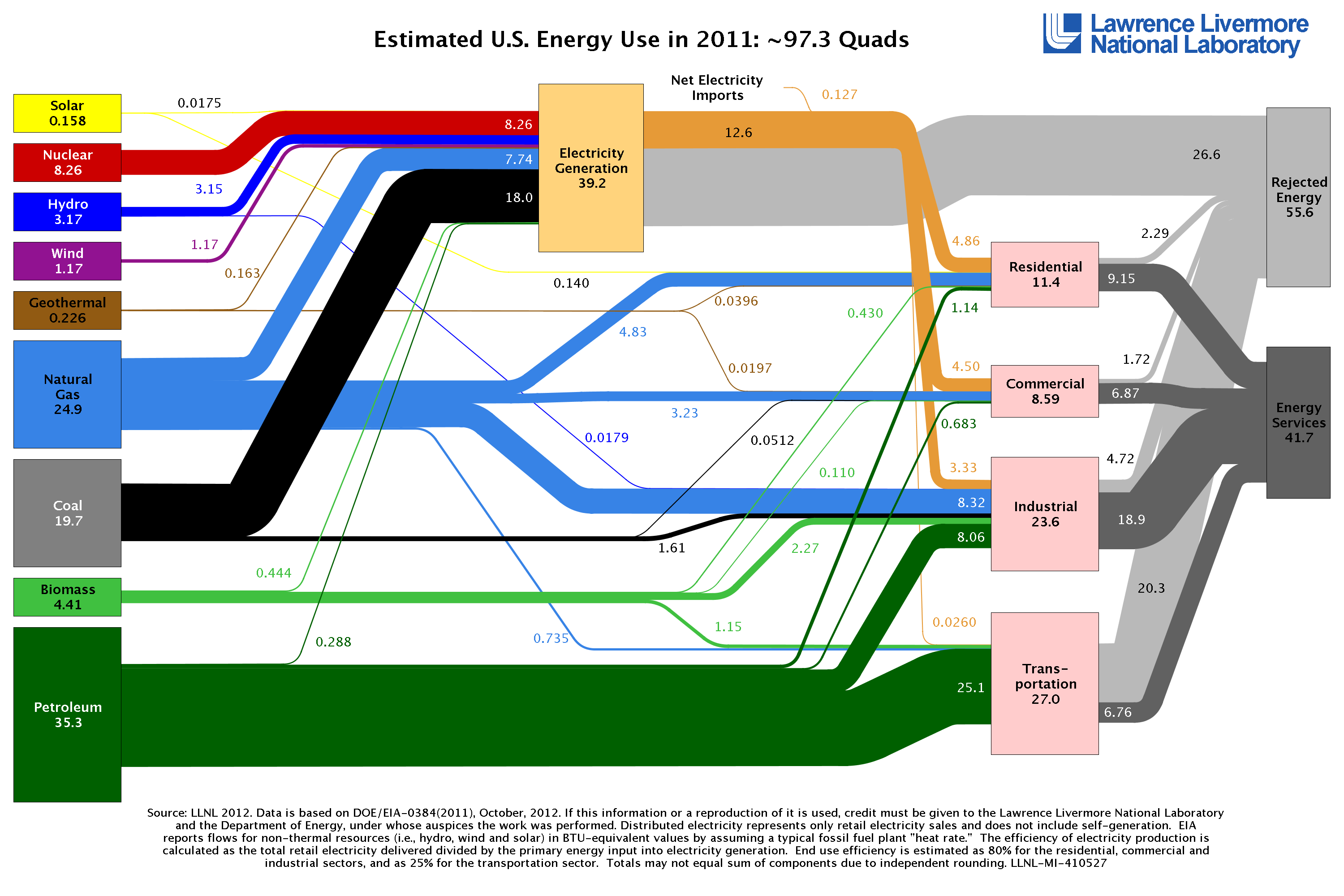
These flow charts give you a sense for the magnitude of our energy supply and consumption. We can also see the complexity of our energy systems. We found it particularly interesting to compare the 2019, to data from prior years, like 2016 and 2011, for example.
Big picture data and what it tells us


Take note, in particular, of the natural gas and coal resources in 2019 and 2016. Notice the relative contributions of coal, natural gas, solar and wind to electricity generation. Take a look at how each sector (commercial, industrial, transportation) consume these resources. Also, it is interesting to note the overall energy services delivered by sector (as compared to the “rejected energy” by sector).
Now take a look at these flows for the year 2011.

These graphics depict the shift in energy resources from coal to natural gas, particularly for electricity generation. The significant shift in end use efficiency is also striking– note that this shift likely has more to do with how LLNL calculated energy use efficiency and less to do with an actual decline in end use efficiency in key sectors. It will be important to watch how energy end use changes in these sectors over the coming years.
NY Energy Consumption 2014: Overview
The Lab has a similar flow chart that depicts New York energy flows specifically, which is where the majority of our customers is.

Note the significant dependence on natural gas as a fuel for electricity generation. When customers ask us why natural gas pricing tends to set the price for power, this kind of background information can be informative.
It will be very interesting to look at what happens in 2020… these sources, flows and demands will certainly show significant disruption on a level we haven’t seen in this country thanks to the economic and social disruption caused by the pandemic. The question is: will these shifts be temporary, or will there be a change in the dynamics of our energy economy going forward?
Bottom line for energy buyers: While you’re in the midst of managing your energy costs and understanding your day-to-day operation, it can be instructive to understand the larger dynamics impacting energy markets and usage. In many respects, the energy industry is in transition both on the supply and demand side. These graphics visually represent these changes.
